I led a standout Holiday experience that brought joy, ease, and inspiration to the Target guest journey. Built on a strong creative idea and executed with rigorous attention to in-store experience, this work became the lead expression of the omnichannel Holiday campaign. Months of close collaboration with a large, cross-functional team helped scale the vision across channels and guide the work of internal partners and external agencies. The result was a cohesive, joyful Holiday world that transformed Target stores into a true Happy Place, a one-stop destination for the season.
Real Stories. Real Men. Guts and Glory.
This campaign stripped away polish to tell it like it is. Ram featured real men sharing real stories, no Hollywood spokespeople, no fashion models, just lived experience and hard-earned pride. The result was a film series grounded in authenticity, strength, and honesty, reinforcing Ram’s commitment to power, purpose, and the unmistakable spirit behind HEMI®.
Creative Director: Samantha Jiménez
For Colgate Sensitive Instant Relief, we set out to make tooth sensitivity instantly felt, not explained. The creative direction transformed everyday sensitivity triggers into striking visual metaphors that conveyed discomfort at a glance. Cold, sweet, sharp, and abrasive sensations were exaggerated into objects that looked physically painful, allowing the promise of instant relief to register immediately without the need for copy.
The art direction leaned heavily into physical craft and realism. All visuals were created using real, large-scale props that were designed and built specifically for the shoot, then photographed practically to capture authentic texture, light, and detail. Avoiding digital shortcuts gave the work a tactile intensity and credibility that elevated the idea. Executed as a two-wave print campaign, the series expanded the visual language while maintaining a consistent, ownable look, reinforcing Colgate Sensitive as the solution to sudden, everyday pain.
This Back to School campaign for Promo introduced a fresh, modern visual system inspired by bold color-blocking and the precision of “Things Organized Neatly.” Products were arranged in object-driven grids to deliver immediate visual impact, while models lived within a graphic, geometric world that elevated color-blocking into a fully immersive environment. By blending these cultural trends, we created a styling approach that felt both soothing and magical, bringing clarity, energy, and modernity to the season.
Creative Director: Samantha Jiménez
Art Directors: Mike Fromelt, Jessie Schneider, Morgan Schiferl, Mychaela Bueche
Copywriter: Susan George
AT&T set out to enter the contract-free wireless space with Aio, a new nationwide service designed for consumers seeking a premium experience at a value price. We created a bold, optimistic world where color, joy, and simplicity surrounded people, signaling a fresh alternative to traditional wireless brands.
Aio introduced clear choices, a seamless customer experience, and simplified offerings built around unlimited talk, text, and data, all without an annual contract. Through expressive design and an approachable visual language, the brand made contract-free wireless feel accessible, modern, and genuinely delightful.
Aio became Cricket after AT&T acquired the brand.
Associate Creative Director: Samantha Jimenez
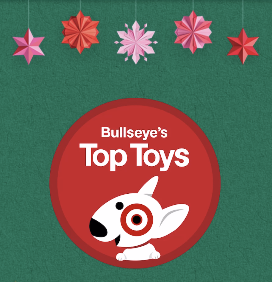
A large-scale in-store AR experience designed to showcase Target’s top toys of the season. Guests scanned QR codes on floor decals and custom aisle endcaps to unlock a playful, kaleidoscopic digital world where Bullseye welcomed them in. The experience invited guests to virtually interact with featured toys, turning in-store discovery into an engaging, joy-filled moment.
Creative Director: Samantha Jiménez
Mother’s Day 2020 carried deeper meaning, offering a rare moment to celebrate connection and joy during a global pandemic. With Mother’s Day and El Día de la Madre aligning on May 10, we saw an opportunity to honor mothers across cultures through a unified, inclusive expression of love and gratitude. Two distinct Weekly Ad front covers were created to speak more personally to different markets while celebrating a shared moment.
We developed a multi-channel promotional campaign aligned with Target’s enterprise Holiday strategy, adding a distinctive creative twist. Illustrated florals originally designed for the in-store experience were reimagined as handcrafted paper flowers, brought to life through stop-motion animation. The result felt tactile, human, and quietly magical, resonating strongly with guests and inspiring other teams, including a featured installation at the top of Target HQ.
Creative Director: Samantha Jiménez
Art Director Captain: Heather Bahr
Art Directors: Jessie Schneider, Mycha Bueche, Rebecca Shalloway
Copywriter: Susan George
Agency: Target Creative
This campaign introduced GE’s next generation of refrigerators, designed to keep food fresh through advanced preservation technology, not just cold temperatures. The creative challenge was to communicate that benefit instantly while delivering a bold, visually disruptive expression that still felt refined and credible. Striking imagery transformed fresh ingredients into dynamic, almost suspended moments, making the technology feel tangible and intuitive. The result was a sophisticated, high-impact campaign that reframed freshness through innovation, reinforcing GE’s belief that technology drives progress, and people are why it matters.
This print campaign reminded consumers that McDonald’s breakfast begins at 5 a.m. by turning an everyday moment into a brand signal. Inspired by the quiet beauty of sunrise, the work reimagined the early morning horizon with a subtle McDonald’s presence, suggesting that the day doesn’t truly begin without breakfast. The result was a simple, poetic visual system that paired optimism, timing, and appetite, proving that sometimes the best reason to wake up early is already waiting for you.
For Advance Auto Parts, exceptional service is the brand’s defining promise. This campaign leaned into that truth, showing just how far AAP will go to ensure their teams are ready for anything. Built on a universal insight, we all value great service and the people who go above and beyond to deliver it, the work launched across multiple markets as a humor-driven platform with a clear, ownable message: service is what sets AAP apart.
To bring that idea to life, the campaign embraced spectacle and wit, including a real-world stunt where three cars were dropped from an airplane to prove the point. The experience extended beyond advertising through a custom app designed to deliver AAP’s service mindset anytime, anywhere. Features included a store locator, a Virtual Mechanic powered by sound recognition technology, QR-enabled how-to videos, online shopping, and a robust tutorial library, turning service into an always-on digital utility.
This campaign for GE refrigerators communicated a simple but powerful truth: freshness should last longer than time itself. The creative challenge was to express advanced food-preservation technology in a way that felt immediate, intuitive, and visually striking. By treating fresh food as if time had barely touched it, the imagery delivered the benefit at a glance, making innovation feel effortless and desirable. The result was a clean, impactful visual system that reframed food preservation through the lens of precision, longevity, and smart technology.
This campaign announced SiriusXM availability across the Volkswagen lineup by tapping into the shared language of music and the road. Inspired by iconic song titles referencing streets, highways, and avenues, the creative transformed everyday street signs into visual cues that doubled as music puzzles for the viewer.
Placed in Rolling Stone, the work spoke directly to music fans, delivering the message in a way that rewarded cultural fluency and curiosity. The result was a smart, understated campaign that blended discovery and delight, reinforcing Volkswagen’s promise that every drive comes with its own soundtrack.
This print campaign for Enough Is Enough, a nonprofit organization dedicated to protecting children and families online, focused on raising awareness around the dangers of internet pornography and sexual predators.
Three prints ran in the Sunday newspaper puzzle section, using direct, impactful visuals and messaging to confront a difficult subject with urgency and responsibility. The work encouraged awareness, conversation, and action, resulting in a clear, uncompromising campaign designed to make digital safety impossible to ignore.
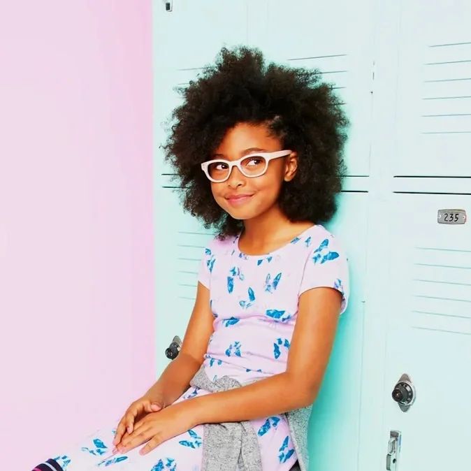
Back to college made fun and simple at a great value so that it’s so easy to get the semester started! Inspired on the Back to College catalog look & feel, we developed a style guide rich in neutral colors, bright lighting, and clean patterns while infusing every moment with a lived-in atmosphere to make it all look like a slice of life.
Colors in props, environments, and products were harmonized in each composition to make the campaign pop no matter the channel. At the same time, all content was created to offer the guest an easy-to-shop experience.
Creative Director: Samantha Jiménez
Art Directors: Heather Bahr, Denise Dunham, Lee Christiansen, Jessie Schneider, and Rebecca Shalloway
Copywriter: Craig Lesterson
Creative Director: Vicky Iacarella
This project reimagined Chocolate Abuelita as more than a beverage, positioning it as a symbol of warmth, love, and togetherness. To launch a special Mexican hot chocolate edition, we invited contemporary Mexican artists to reinterpret what chocolate means in their lives, transforming the packaging into a canvas for personal and cultural expression.
Six artists created original works inspired by memories of family, intimacy, celebration, and everyday joy. Together, the collection became an art gallery for the pantry, turning each package into a meaningful object rather than just a product. The result honored the emotional role of hot chocolate in Mexican culture while elevating the brand through authenticity, craft, and storytelling. The collection was recognized as a finalist at the London International Awards.
This Valentine’s Day Promo campaign was built around assortment and value, anchored in Target’s core brand promise: Expect More. Pay Less. The idea was intentionally open-ended, inviting guests to expect more of everything they love for the holiday, more candy, more gifts, more flowers, all for less.
To drive urgency and break through a crowded Valentine’s landscape, the creative centered on an “explosion” of product, a bold burst of color and abundance that showcased Target’s breadth of assortment, deals, and low prices. Humanity was woven throughout through expressive hands and moments of exchange, highlighting the many ways love is shared. The result was a visually disruptive, joyful celebration of love, delivered at unmistakable value.
Creative Director: Samantha Jiménez
Art Director Captain: Heather Bahr
Art Directors: Stephanie Hofmann, Mycha Bueche
Copywriter: Susan George
Agency: Target Creative
This TV commercial kicked off Spring with a nature-inspired project designed specifically for Latinos. Rooted in the seasonal insight of renewal, the idea brought the outdoors in, transforming garden elements into an unexpected, fresh interior statement.
The broadcast spot sparked strong audience response, particularly around the picket-inspired headboard featured in the ad.
This 360° launch campaign introduced car2go nationwide by redefining what a car could be. Rather than positioning it as a vehicle, the idea framed car2go as a connector, unlocking access to the city and enabling people to experience more of everyday life. Branded as “The Un-Car,” the platform challenged traditional car ownership and repositioned mobility as freedom, flexibility, and possibility, delivered through an immersive, multi-channel experience.
Role: Led this new business pitch for the launch of car2go as an Associate Creative Director
Agency: Latinworks
This radio campaign for Liverpool, one of Mexico’s most sophisticated and influential retailers, promoted a mattress sale through a simple, human insight: sleeping well changes everything, and the difference is felt by more than just you.
The audio leaned into the transformative power of rest, using tone and pacing to mirror the feeling of better sleep while reinforcing Liverpool’s position as a destination for elevated living. The result was a clear, compelling message that made comfort feel immediate, personal, and worth investing in.
This radio campaign extended Snickers’ iconic “You’re Not You When You’re Hungry” platform to Hispanic audiences through culturally resonant audio storytelling. To authentically connect with Latinx listeners, the work drew inspiration from beloved, melodramatic songs widely known across Latin America, music rooted in heightened emotion and recognizable storytelling.
By keeping the original melodies and reworking the lyrics, the spots immediately felt familiar while humorously reframing the songs through the lens of hunger-driven behavior. The result was a set of audio ads that felt playful, culturally fluent, and instantly recognizable, successfully translating a global campaign into a locally meaningful expression without losing its core idea.
This radio campaign for Viva, a beloved laundry detergent brand in Mexico with strong relevance among Latinx audiences in the U.S., brought the brand promise to life through sound. Rooted in the insight that time matters most when it’s spent with family, the spots reframed laundry as something that shouldn’t get in the way of what truly counts.
The work translated Viva’s promise, less time doing laundry, more time living, into warm, relatable storytelling designed for everyday moments. I led the creative development end to end, from concept and writing through directing the recordings and final mix, delivering audio that felt intimate, human, and culturally resonant.
This personal study explores typography through the lens of wear, time, and place, inspired by a long-standing admiration for David Carson’s unapologetic approach to design and the cultural moment that once predicted the end of print. During a visit to a private airport, I documented found typography across airplanes, tires, cargo trucks, pavement, and machinery, treating the environment itself as a living type specimen.
Shot at Coolidge Municipal Airport in Arizona, the work captures how daily use, weather, and time naturally erode letterforms, creating texture, character, and imperfection. Existing surfaces, rust, cracks, and patina, combined with restrained vintage treatments, place the compositions in a visual space reminiscent of late-’80s grunge, where typography feels raw, expressive, and undeniably human.